Elvis
[This page is an archive. To comment, please see the original post, here,.]
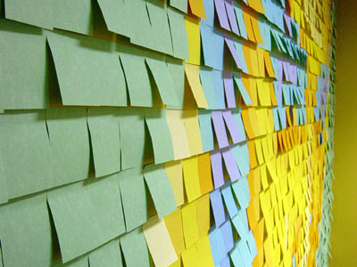
More images can be found in the flickr photo set one of my officemates, Scott Reston, took of the mosaic after it was finished. the detail-oriented will notice that the pupils have been swapped out with blue, rendering the piercing gaze slightly less disturbing. that’s my boss’ back you see in the second shot.
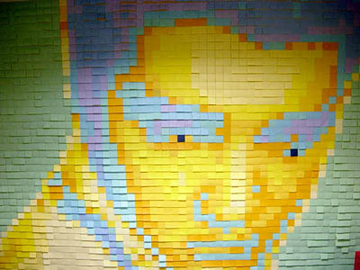
what’s this? squint and you can make it out… it’s Elvis.

look closer.
yep. those are post-its.
my boss decided that we needed to do something fun and creative in one of our conference rooms – the one we use for brainstorming and internal meetings – and together we came up with the idea of filling the wall with post-it notes in a multicolored mosaic of (and i’m not sure whose idea this was) Elvis.
since it was revealed the day after memorial day, and after mentioning it to some people, i’ve gotten a lot of the same questions over and over, so i decided to write this article to answer all those questions as well as serve as a howto for others choosing to waste office supplies in a similar artistic endeavor.
as you can see, we chose to use two contrasting color palettes – aquatic and sunbrite – for a total of 10 unique colors in the image, plus an eleventh dark blue for Evis’ pupils. there’s something to be said for the psychedelic quality of mixing blues and oranges. there are something like 34 different colors to choose from, and that’s only the 4- and 5-packs. in the single-pad packages, there are a few others, even dark colors for use with gel and metallic pens and markers – not that they’re anywhere to be found on the 3M website – check with art and craft supply stores if you want the darker variety. the creepy pupils in Elvis’ eyes are a dark blue post-it shade that i stumbled upon in a craft store. in all, post-its, as a medium, make for a fairly complete color palette.
not that you can actually purchase most of the colors individually from 3M, or anything directly from them, for that matter, even in bulk. most of the colors only appear in the 4- and 5-packs (and sometimes 6- and 12-packs) and are never sold individually. that is, unless you make a special order of 60,o00 or more, typically with your logo or other personalized marketing message imprinted on them. also, unless you’re making such a special order, 3M only sells post-its through resellers and retailers (staples, office depot, etc).
what you’ll need:
a wall.
preferably a good smooth one, uninterrupted by furniture, outlets or other protuberances. it also helps if the finish is one that isn’t marked or damaged by the glue on a post-it (not likely, given the formulation of the glue, but worth a test note or two). while you’re at it, make sure it’s a finish that a post-it can actually stick to. a big picture window would work just as well, if not better – the image will be viewable from both sides.
an image.
this is the easy part. my boss and i chose Elvis because… well, it’s Elvis. and we’re both big fans.
our original image:

photoshop.
or another image manipulation program that can change the size and color palette of an image. imageready will probably do just as well, but i doubt photoshop elements or LE will work. fireworks may also work, but not being a third-degree blackbelt in anything but photoshop, i can’t vouch for them.
the post-its.
measure the wall. divide the width of the wall in inches by the width of your chosen post-it (the “standard” is 3” x 3”). do the same with the height. simple math, really. anyway, that’s roughly the number you’ll need. big number? it’s a big wall… ours ended up being 63 notes x 42 notes, which meant i ended up applying 2,646 sticky notes. by the end, i was having flashbacks of the seinfeld episode where susan was poisoned by envelope glue. i was sure someone was going to come in after the long weekend and find me curled up in the corner, glued (however temporarily) to myself.
time.
the above wall and its 2,646 notes took roughly 10 hours to apply. this is somewhat a worst-case estimate: while i was doing it, i was also multitasking doing other things around the office to preserve my sanity. i was also working alone. with only a vague idea of how best to approach the application, i ended up removing and redoing large sections more than once. remember, more hands make lighter work – as long as your helpers don’t end up getting in the way.
step one-ish: prepare the image.
you’ve done the math. you know how big your image is going to be in post-it-sized pixels. resize (and probably crop) your selected original image to this size in photoshop (in the menubar “image” -> “image size”, or with the cropping tool, use the tool’s options palette to restrict the cropped size to your final dimensions in pixels @ 72 px/inch). if you’re after true-ish color (red notes representing red pixels in your image) be sure your image mode in photoshop is set to RGB – not indexed color. otherwise, if dark colored notes will be dark pixels, light colored ones light pixels, etc, set the mode to grayscale before resizing.
![]()
while you could work with your image at this size, zoomed in at 800 or 1600%, you’re probably going to want to add a grid, and print out your creation at some point (as a referfence for when you’re actually putting notes on the wall). for the moment, though, keep your image this size, as you’ll want to preserve those pixels.
you’ve picked out your palette by this point, right? you may want to start with the images here for a guide or scan in some notes you’ve gotten as samples. working with the actual palette will come up shortly. for the moment, though, you’ll at least need to know how many colors you want to use. one family of notes will have either four or five colors in it, which are purchased together. so, for efficiency, you’ll likely want to use all the colors from one or two families.
this is the tricky part. really.
you have your image open in photoshop (or editing app of your choice) and it’s either in RGB or grayscale color mode. go to image -> mode and select “indexed color.” in the palette that pops up, select “local (adaptive)” and the number of colors you’ve settled on. uncheck transparency if it’s checked, and check the preview checkbox. if you like what you see, hit the ok button and go to the next step. if, however, you’re not satisfied with what you see, try the “forced” setting on “black and white” (this will set the lightest color to white and the darkest to black, with the remaining colors in your limited palette dithered somewhere in between. it makes more sense on grayscale images than color ones, tho). you may also want to try changing the dither menu settings. different selections will change how to deal with the pixels that don’t fall on or about one of the new colors – either force them to the nearest color (none) or take the chunks of in-between color and “speckle” or dither them to create a pattern that, if you averaged it out, would be equal in ratio of two colors as the original pixels were.
okay, that made no sense, but if you ever deal with dithered colors, you know what i’m getting at. everybody else, just fiddle until you like what you see.
now, you’ll want to save your dithered, pixellated image. be sure not to replace your orignal as you may need to start over. i did. several times.
resize the image to a more reasonable size. something easy on the eyes, like 10x it’s current size, will give you big enough pixels to hit with the eyedropper and draw a grid on top of later. in the “image”->”image size…” palette, uncheck the “resample” checkbox and make sure that “constrain proportions” is checked. then, to multiply the pixel dimensions by 10, simply add a zero to the end of the width (in pixels) value. the height should magically do the same. easy multiples like 10 will come in handy later, so don’t get fancy
now, do you have big, chunky pixels? cool.

step two-ish: prepare your palette.
create a new photoshop document wide enough to accomodate as many blocks of color as your chosen post-it palette contains. this i will refer to as the “palette image.” with the paintbrush or marquis/paintbucket make some blocks of color that approximate the post-it colors you’ve chosen. liberal use of the eyedropper on your scans or the sample images from 3m.com is probably called for here.
if you know what you’re doing in photoshop or imageready, you can probably see where i’m going with this. if not, use option “b” below.
option a: reduce that palette image down to the required number of colors, in a process similar to what we did above, only be sure to set dithering to “none” so all your sample chunks are solid colors. then save that image’s palette and apply it to your mosaic image.
option b: open the mosaic image and your palette image side by side. set your mosaic image back to RGB color mode. select the magic wand tool, and uncheck “contiguous” and “anti-aliased” in the options, and set the “tolerance” to 0. select one of the colors of your mosaic image (all blocks of the same color should be selected). switch to the paintbucket tool and option-click on your palette image to select the color those blocks should be filled with. then click back on your mosaic image. those selected blocks should now be filled with the color you chose. repeat with each color in the mosaic/palette.

step three-ish: reference material.
now that you’ve got a mosaic in photoshop that’s about the right colors (it’s fiendishly difficult to match the color of paper on a computer screen, but you can get close) it’s time to figure out how many post-its you’ll need to buy, as well as print out your image as a map to follow when applying your masterpiece to the wall.
grab a pen and something to write on. you’ll take this to the office supply store with you.
back in photoshop, open up the rarely-used but immensely useful “histogram” window (it’s under the “window” menu). in that window’s options, select the “all channels” view. with the magic wand tool, select one color’s worth of pixels. you’ll see the number of pixels you have selected appear in the histogram window. with some simple math, you can figure out how many post-its that number represents (if you resized your image 10x in the previous step, you’ll just have to knock two zeros off the end, otherwise, divide by the square…)
write those numbers down, preferably alongside the name of the color or post-it color family to which the color belongs.
in order to better facilitate mapping out your installation, you’ll want to add a grid to your photoshop file. this can be accomplished a number of ways, but the fastest is to draw with the pencil tool, on a new layer, a box the size of one note (10 pixels square). leave off the bottom and right sides of the box and select the 10px square with the marquis tool. go to “edit” -> “define pattern” and save your pattern as something witty like “10px grid”
select everything on that new layer (with just your half-box on it) and hit delete. then go to edit -> fill. select “pattern” and select your grid pattern. your new layer should now be the desired grid. adjust the transparency until it is more pleasing to the eye, save and print that out. it’s a good idea to make the page size as large as you can manage on your printer, so you don’t have to squint at your printout while applying post-its to the wall.

step four-ish: gather the materials.
now you know how many notes to get of each color. go to your local office supply store, or order online or however you get your post-its. be aware, though, that not every pad of post-its will have the same number of notes. different packages have pads with different numbers of notes in them, so check the label to make sure you get enough – if i recall correctly, five-packs have five 90-note pads and six- and twelve-packs have 80-note pads, so check the label and do the math. you’ll inevitably end up with leftovers, which you can go crazy with and actually use for taking messages with.
step five-ish: notes on the wall.
looking back, i probably could have used a laser level, chalkline, or even a projector with my original photoshop file to facilitate straight and square application of notes on a less-than-square wall. oh well. i think it looks pretty good for having been done freehand.
you’ll find your own rhythm and preferred way to tackle the problem, and the best thing about this medium is it’s temporary – if you mess it up, you can take everything down in moment and start over.
due to the manufacturing process, post-it pads aren’t all exactly the same size. in creating the Elvis mosaic, i found that there is often as much as an eighth of an inch difference in size between one pad and another, with typical variances being around 1/16th of an inch. that may not seem like much, but over the course of a wall 42 notes wide, that variance is noticeable. adjust your rows and columns accordingly, or just leave gaps between the notes and let the wall show through like grout between tiles. luckily, they’re square for the most part, but you’ll probably still want some kind of level or chalkline on the wall to keep your lines straight.
post-mortem:
unless you restrict yourself to the new super sticky post-its you’ll likely have a few succumb to gravity after only a few hours. these deserters can be easily reapplied or replaced. with humidity, changing temperatures, and ventilation, more will eventually fall off. remember that the whole idea of the post-it mosaic is temporary, fleeting. nondestructive expression.
share and enjoy.